Case Study:
Improving the User Experience of a Quarterly Brochure
Every quarter, Housing Works publishes a brochure listing their upcoming sales and events. After using the same layout for several issues, it became clear that there was a better way to organize the information. Working with the advocacy department and the entrepreneurial business teams, we were able to identify several areas that needed improvement.
UX Challenges
Housing Works’ mission statement stood alone often placed in extra space and did not connect to a call to action. The driving force behind the nonprofit was seemingly an afterthought.
The goal of the brochure is to tell Housing Works’ community about upcoming events. However, only one page in the trifold brochure featured an events calendar. Highlighted events lived on a separate ‘Highlights’ page, but on occasion were also in the events calendar.
Additionally, with one bookstore cafe and 14 thrift shops throughout Queens, Manhattan, and Brooklyn, customers often ask for directions to other locations. While the brochure featured the address listings, it did not include details such as cross streets. Shop employees do not have easily accessible internet. Therefore, they could not help their customers in a timely fashion. The contact information, like social handles, location listings, and telephone numbers, were listed on two separate pages. Overall, the lack of organization was visually overwhelming.
UX Solutions
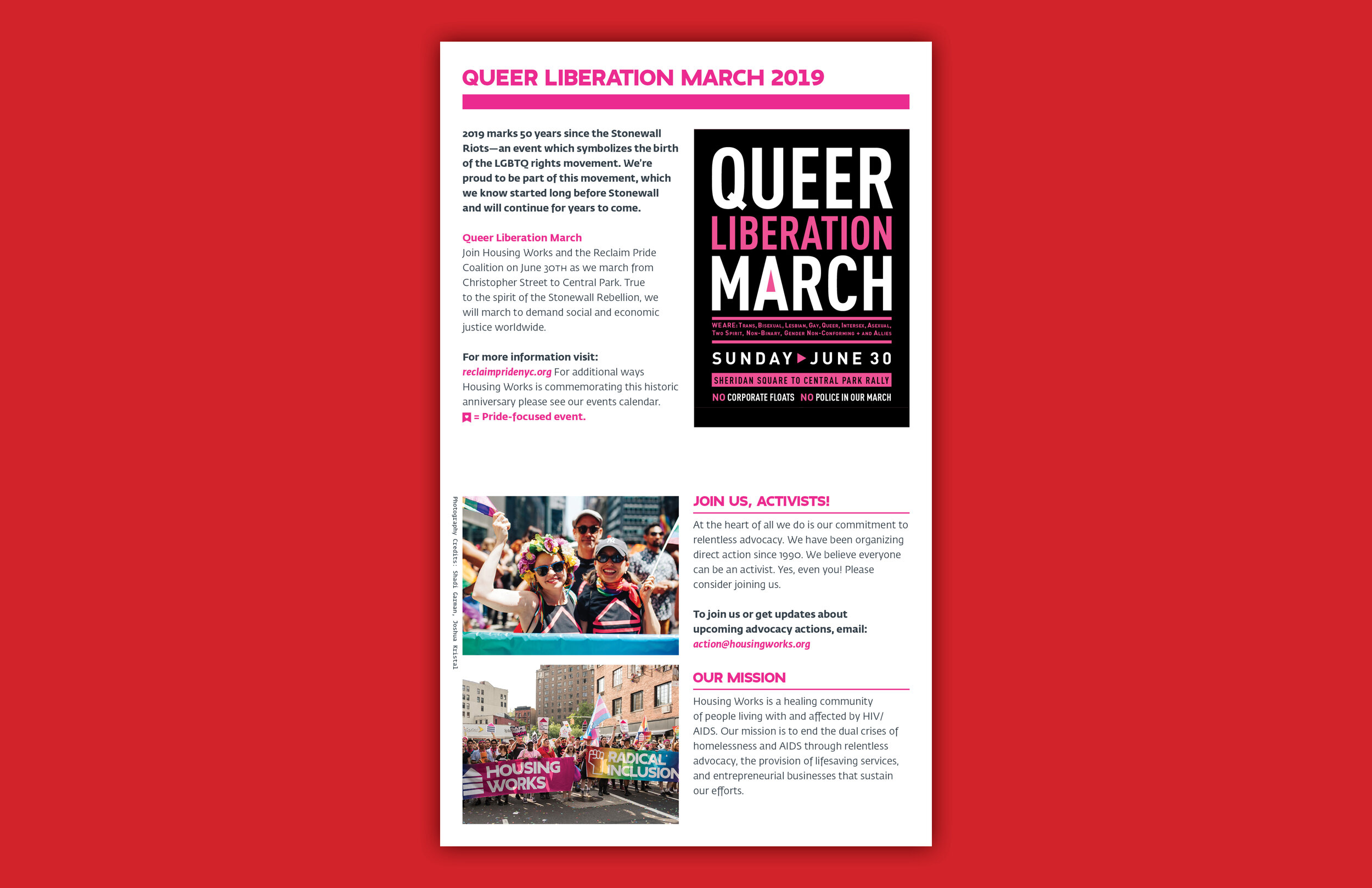
We connected Housing Works’ mission to the businesses’ sales and events by organizing this information on the first page of the brochure. Leading with this reminded and informed customers that shopping with Housing Works directly benefits their trailblazing work in grassroots activism, healthcare, and housing, inspiring customers to join actions. We also created an email address where customers could reach out directly to the advocacy department for information about upcoming advocacy actions.
The events calendar was expanded to two pages rather than one, giving it the majority of the interior space. Before, events would live in different lists based on random filters. In the new brochure, we gave the users the option to filter this hierarchy using callout boxes and symbols. Highlighted events were treated with a special callout featuring a photo and lived within the same events calendar. The event coordinators now have the ability to pick and choose which events they want to highlight without limitation.
The location listings moved to the brochure’s back cover. While opening a trifold brochure does not seem troublesome, we discovered the locations were the most frequently referenced list. It needed to be easily accessible. The locations list was given additional information like the cross streets and paired with the social handle information, making the page a valuable resource for contacting and connecting with Housing Works.
Credits
Client — Housing Works
Role — Design Direction, Design, Copywriting, Print Production
Copywriting — Elizabeth Koke


